Have you ever gotten a tool....one that makes you feel almost invincible?
That is exactly what these new markers make me feel like!!
By now, you've probably heard of a certain marker, rhymes with toepicks....
They're great I'm sure....
But....as a Stampin' Up! Demonstrator, I can honestly say, these Blendabilities HIT THE SPOT!!
Each pack of Blendabilites comes with 3 markers. You can get Daffodil Delight in Light, Medium, and Dark. This allows you to blend them in harmony, without having to think too much about the colors you are choosing. The toepick markers, well you have to make sure you get the numbers right to really get them exact.
Our newest markers are PHENOMENAL!
you can create images like this!
Notice the Ombre hair?
What about the flushed cheeks and the two toned dress and rain slicker?
These markers are AMAZING!!
Lets just talk a little bit about how these markers work, shall we?
These are alcohol based inks. So they blend SEAMLESSLY when you take lighter and darker colors together. There are lots of tutorials out there, so before you go searching for them, I want to show you some different ways that I use these markers.
If you have used these types of markers before, you have seen that you are supposed to take the darkest color....add impact with the dark, then work from dark to light and add some contrast. See how I used a darker color to add depth to the collar of the rain coat and the "girly parts" of the red dress?
what about here?
Two different techniques were used here.
In the big flower, I used dark first, and blended out with the lighter colors. This gives you a greater separation of color and a more dramatic impact.
On the star-shaped flower, I colored the entire flower in the lightest color...added the medium color from the center out, then added the darkest color, afterward I blended the entire flower with the lightest color. This technique gets a softer, more gradual transition between the shades of color.
Both...are truly stunning (in my opinion!!)
Here is another example:
Notice how streaky the colors look and how they don't blend? That is because I used our traditional Stampin' Write Markers! They are a water based ink, and only blend when you use a water pen, aqua painter, or other water soluble product to blend them. There's nothing wrong with them, they're just not quite as seamless. I could blend these a little more by adding water, but we all know what happens when you add water to regular cardstock...and its not always pretty.
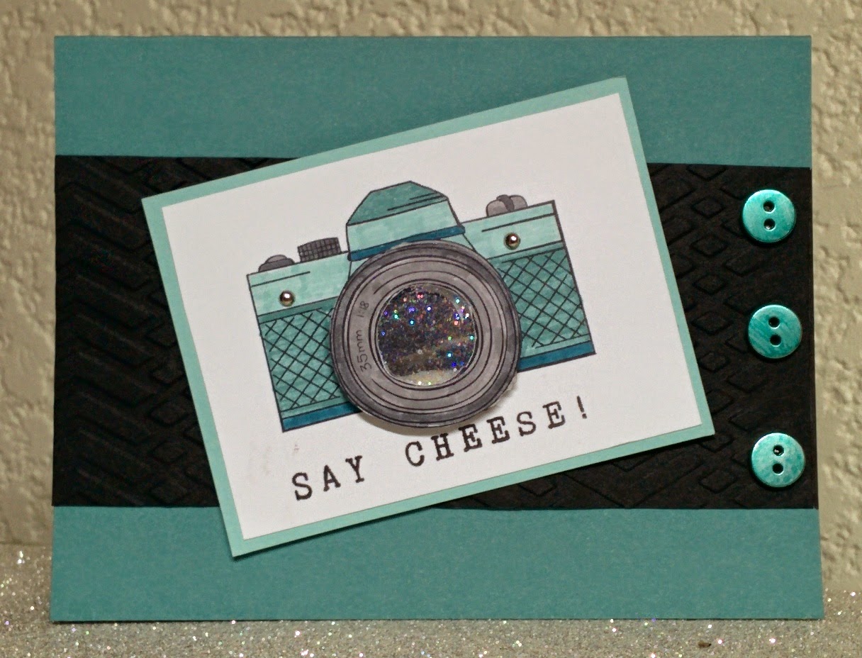
Stampin' Up Blendabilities give you an amazing opportunity to turn ordinary images into extraordinary works of art. Here are the finished cards using the images from above.
Because these markers are alcohol based...you can even color your embellishments!! The button used on this card is actually one of our silver buttons, colored with the medium Daffodil Delight blendabilities. The ink dries super fast, and adheres quite nicely!
In this example, I used the lightest Rich Razzleberry Marker to color the Lost Lagoon satin ribbon to give it a 'rain soaked' look. (also, these inks do NOT smear or lose color when used with the Crystal Effects!)
Want to see more awesome examples ? Head on over to
SSInkspirations and check out what my fellow designers have come up with. There's also a sweet tutorial on how to use our newest marker, the Blendabilities!
Wanna get your hands on a set of Blendabilities? Stay tuned for more information when they become available. Until then, come on over and take a class or two. I promise you, it will be life changing!
~Donna


